Working closely with the team at
Superbold as well as Paulie and Hayley from Synergy Recovery - we created a brand that will standout within their industry and within their home town.
I lead the design direction, coming up with two other concepts and presenting the three options.
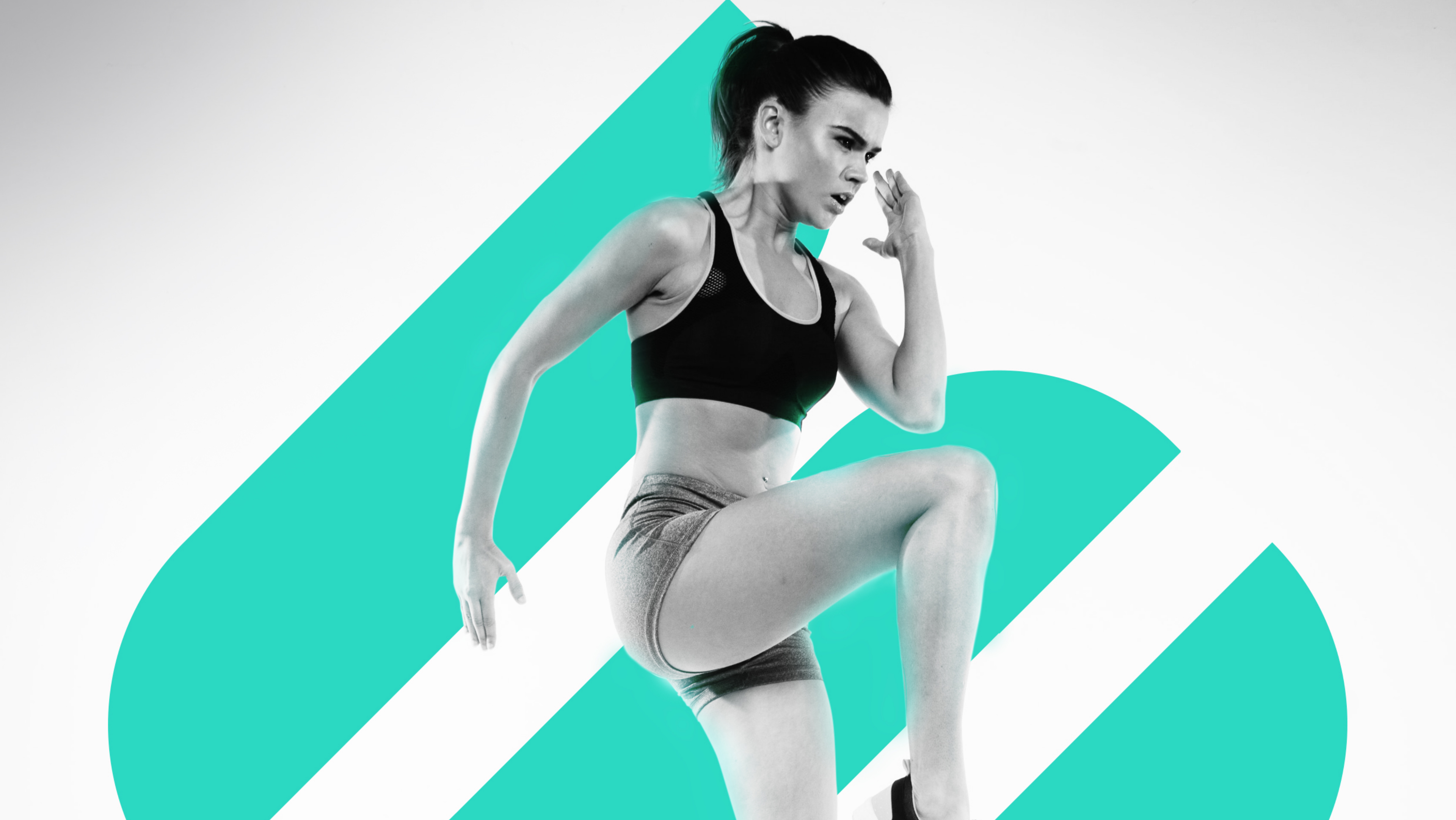
The three layers of the logo mark that makes up the S represent the mind, body and soul and when aligned create synergy. The logomark is slanted upwards and the word Synergy is slanted towards the right to represent upward and progressive motion in someone’s timeline in recovery.
The Synergy Green was chosen as it is a colour they can own in their space, both digitally and physically.

