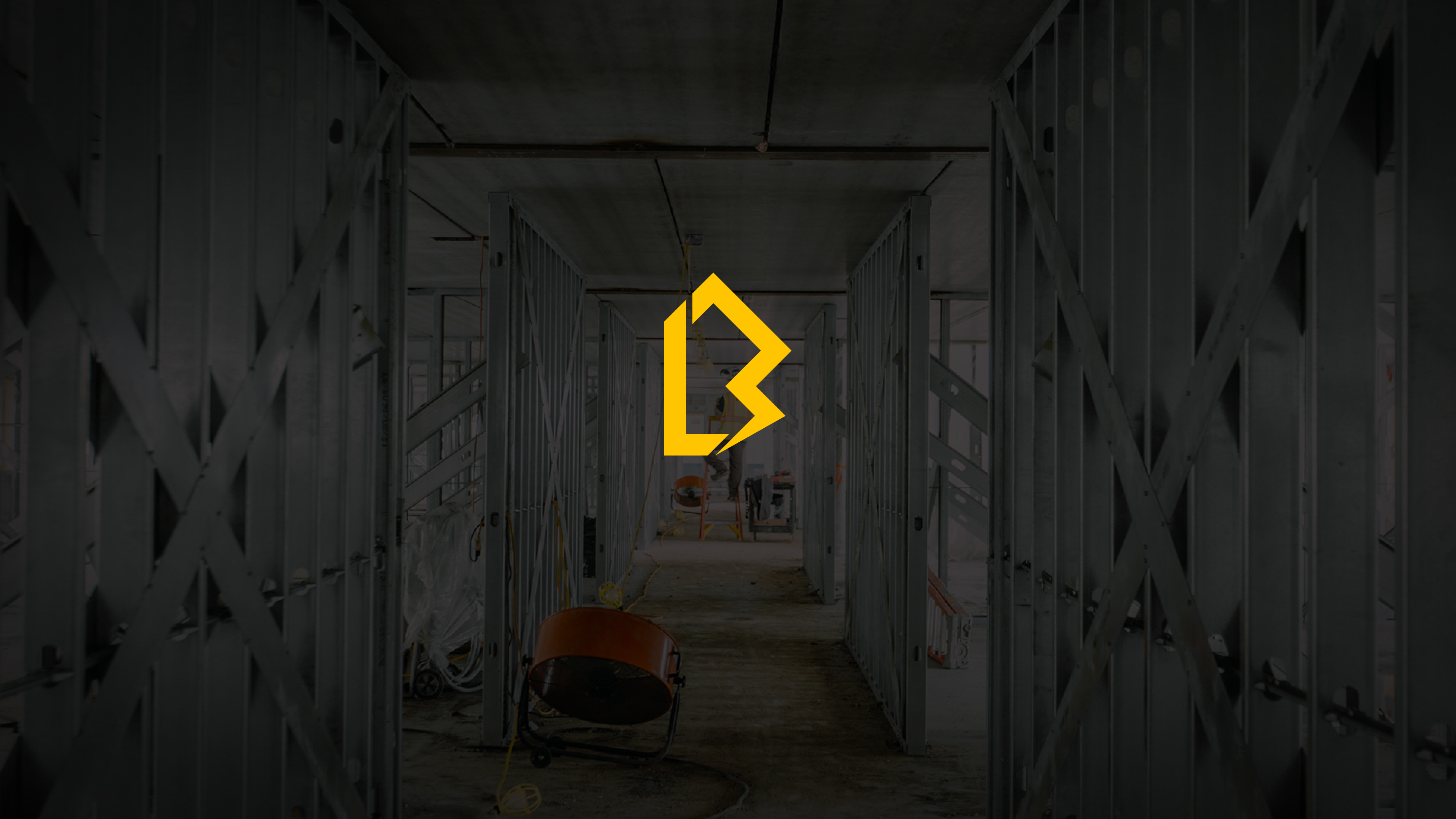
Blair from L.A.B. came to me wanting to brand his new company. In one sentence he mentioned that he wanted his brand to stand out, but still be subtle enough that the L.A.B. brand isn't screaming at you when he passes you in the ute.
We came up with the colour pallete that is high contrast. A gold that stands out, paired with a matte black that works just enough when printed on a black ute, isn't overly noticeable but is still legible.
The logo mark is a monogram that brings together L, the B and electricty. L.A.B. works across the board of electritans, so the top half of the logo subtly represents a residential or a commercial building and isn't specific to one part of the trade.

